Mastering Interior Photography: A Layered Approach to Balancing Flash and Ambient Light for Complex Scenes
As an interiors, architecture, and hospitality photographer, achieving the right balance of natural and artificial light can transform the ambiance of a space and bring out its design details. Today, I'll break down one of my recent shots, taken in a stylish residential space, where I used flash and ambient layers to manage tricky lighting and enhance color accuracy. This photo breakdown provides insight into my layering process, styling adjustments, and final touch-ups to create a well-balanced, captivating image.
This is a pretty complex break down, If you are brand new to interiors photography I would check out this article first!
Gear Breakdown With Amazon links:
Camera: Sony A7RV
Lenses: Tamron 28-75mm shot at 31mm
Lighting Gear:
Tripod and stands:
Inovativ DigiSystem Lite Kit (Laptop holder)
Post-Processing: MacBook Pro, Capture One, Photoshop, Lumenzia
Step 1: Initial Styling Adjustments
When working with interior designers, much of the styling is typically already in place. However, small tweaks can help bring an image to life and convey the designer's vision even more effectively. For this shot, I made subtle adjustments to avoid visual monotony. First, I angled a chair to break up the straight row of seating, added a few pillows to bring pops of color into the foreground, and adjusted cushions for a neater look. Finally, I rotated the faucet to avoid alignment issues, ensuring a clear, unobstructed view of every design element.
Step 2: Building the Image with Three Key Layers
Ambient Layer
To capture this complex interior, I used three primary layers: an ambient layer, a view layer, and a flash layer. Here’s how each one contributed to the final image:
View layer
Flash layer
Ambient Layer
The ambient layer provides a good base for light and shadow but can often bring color inconsistencies. In Capture One, I made preliminary adjustments, lowering highlights, shadows, and adjusting the white balance. Despite these tweaks, color imbalances remained, particularly a cool green tone on the left side of the frame. While not flawless, the ambient layer offered a solid composition with good detail for the next stages.View Layer
By underexposing the view, I preserved the colors and prevented the scene outside from washing out. After slight warming adjustments, I had a realistic, clear view that would be composited back into the windows in Photoshop.Flash Layer
This layer is where most of the "magic" happens. In simpler scenes, a single flash source is often enough, but the lighting complexity here required multiple flash units to achieve balanced, even illumination and color. For this shot, I used a Godox AD600 bounced off a white wall on the left (visible as a reflection in the window) to bring soft, indirect light across the scene. To the right, a Godox AD200 bounced into an umbrella provided subtle fill for the shadows. Additionally, I positioned a Godox V860iii in the far back room and another AD200 in the pantry behind the oven. I then change the camera setting to eliminate nearly all ambient light and bump up the ISO to 800 to give me some extra power from the flashes. This multi-flash setup enhanced color consistency and filled darker areas without introducing unwanted color casts, creating a balanced, cohesive lighting effect perfect for the final compositing process.
Step 3: Compositing in Photoshop
In Photoshop, I brought together the ambient and flash layers to blend each element effectively. Here’s a closer look at my process:
Blending Layers with luminosity layer
I duplicate the ambient layer, setting one to Normal mode and the other to Luminosity (Change this by using the drop-down tab under the word “layers” on the layers tab). I then add a black layer mask to both to blend them in as needed using a white brush. This way, I could pull only the lighting information from the ambient layer, while relying on the flash layer for more consistent color.Strategic adjustments using both flash and ambient layers
For areas like the cabinet lights, the ambient frame worked best, while the flash provided better color in the walls and furniture. The flash layer helped me tone down overly bright lights, such as sconces and pendant fixtures, which maintained a balanced exposure without losing essential highlights. Combining these layers allowed me to highlight each feature and prevent color discrepancies.Integrating the View Layer
An essential part of this project was the view layer. Once the ambient and flash layers were fully blended, I overlaid the view layer on top and carefully masked in the windows to reintroduce the outdoor scenery naturally, without it looking artificial or overly cool. It’s crucial not to overdo this step—the outdoor exposure should feel realistic and balanced with the interior, typically set one or two stops brighter for a cohesive look.Flatten and clean up
Once the primary layers were composited, I flattened the image and began retouching blemishes like speakers, smoke detectors, outlets, and light switches.
This combination of layer blending and selective adjustments created a balanced, realistic look, setting a strong foundation for the final touch-ups.
Step 4: Cleaning Up and Final Edits
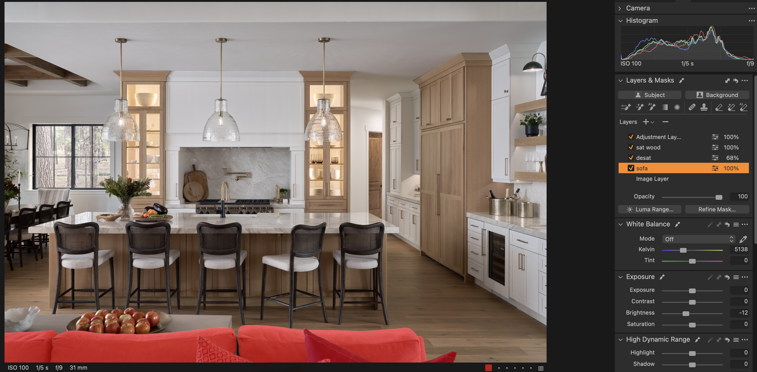
The final step in Capture One involved several global and selective adjustments using the AI selection tools. If you dont have Capture One you can make similar selections in Photoshop using tools like “Color Range” in the selections tab. This is for minor adjustments only as major changes will be obvious or require a very defined mask.
Desaturate the white areas just a bit
Do some color correction on the wood tones
Darken the sofa in the foreground
Selective Darkening and Desaturation
Using selection tools, I darkened the sofa slightly to keep it from drawing too much attention and desaturated white areas by around 20-30% to clean up any residual color issues. This step ensures that white accents remain true to their intended color without appearing overly stark or unnatural.Wood Tone Adjustment
Getting wood tones accurate is one of the most challenging aspects of interiors photography. I created a separate adjustment layer for wood elements, fine-tuning their saturation and warmth to match the designer’s vision and ensure color consistency throughout the scene.
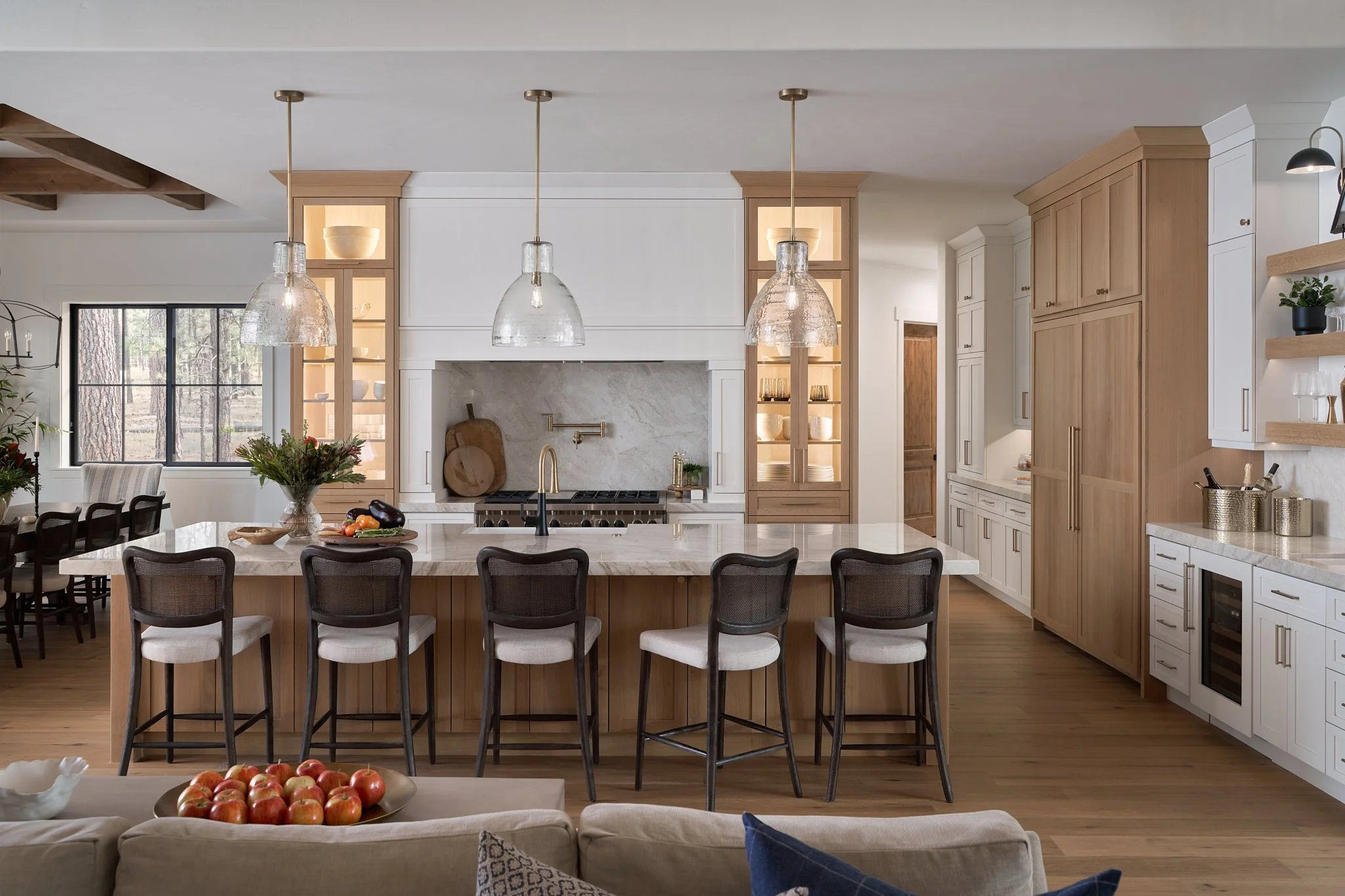
Final Image
Conclusion: Bringing It All Together
Through a combination of flash and ambient lighting, along with meticulous adjustments in Photoshop and Capture One, I achieved a balanced, well-lit image that accurately represented the design and ambiance of the space. As an interior design and hospitality photographer, I hope this walkthrough provides valuable insights into the art of layering in interior photography, helping you create well-composed, high-quality images that truly highlight the essence of each space. Whether it’s balancing tricky lighting or making subtle styling adjustments, a keen eye and thoughtful approach can go a long way in transforming a space through your lens.
Feel free to ask questions in the comment section below and Ill be sure to answer!
Want to learn more about choosing the right focal length for interiors photography? Check out this Article.


